QUESTION
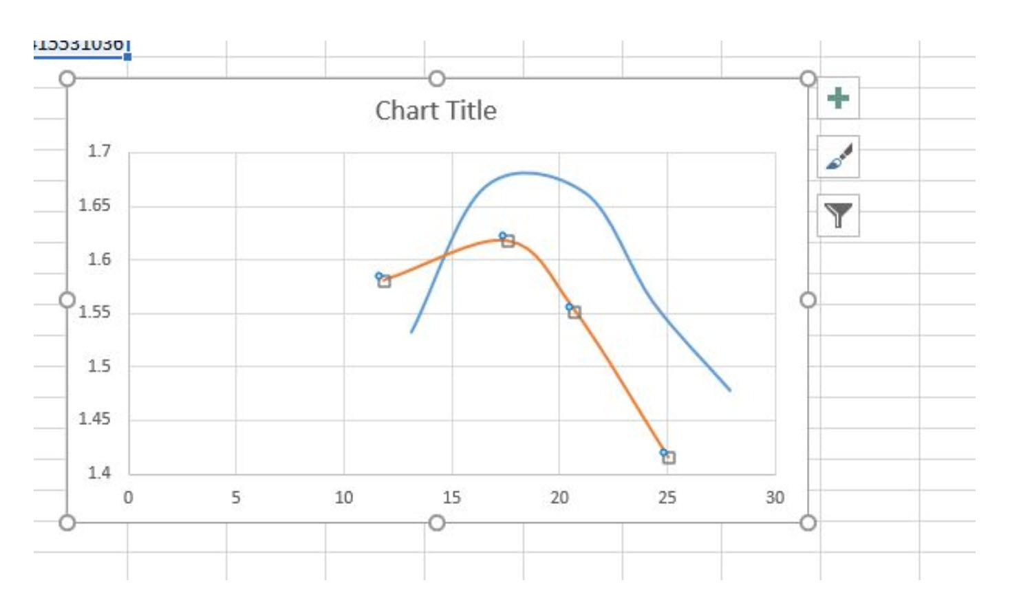
This is a relationship between moisture content and dry density. Blue curve is for standard proctor test.( 2.5kg,30cm,3 layers, 27 bowls , in 1L mould = 595.9575kJ/m3) and for red one is like modified proctor test but (4.5kg, 45cm ,5 layers ,35 bowls ,in CBR mould(4L) =896.1046875 kJ/m3 ) . But I expect red one to move left side with moving top . But actualy I got this. What is the reason?
emmgjld
I have seen this when the samples (in this case the modified set) was not allowed enough time to ‘set’ and allow the moisture to penetrate the soil (clayey?) particles before compaction. The shape of the modified curve also fit this scenario.
The curves are backward. Unless the Modified curves were pumping badly (built up pore pressure during the compaction part of the test), the Modified curve will result in a higher maximum dry density than a Standard curve. Also agree with emmgjld that you can get some strange results in clayey soils, silty soils and clayey-silty soils because of incomplete moisture distribution.
I also note that the moisture points are about 4 percent apart. That’s a rather large separation and can sometimes cause issues with defining the maximum dry density. Further, the energy input was varied on the modified Proctor, so it makes standard comparison more difficult.
It would also be a bit easier to discern issues with the test if the zero air voids curves for these soils were shown.
Many clayey soils (and other fine grained soils), as emmgjld noted, need to be “pre-soaked” before running the Proctor test. My typical procedure was to mix the soil in at different moisture contents in 4 separate plastic concrete cylinder molds, seal them from moisture loss, and let them sit overnight. That way the moisture has an opportunity to permeate the samples, making the curve more accurate and predictable.